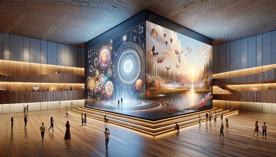
Minimalism is a design principle that prioritizes simplicity, clarity, and functionality in interactive design. It aims to create a clean and uncluttered user interface that focuses on essential elements and content. This approach is closely related to the concept of aesthetics in interactive design, as it emphasizes the beauty and visual appeal of the user interface while maintaining usability and practicality.
Core Principles of Minimalism in Interactive Design
Minimalistic design in interactive interfaces is guided by several core principles:
- 1. Simplicity: Minimalism advocates for the removal of unnecessary elements and features, striving for a clean and straightforward user interface. This simplicity enhances user experience by reducing cognitive overload and promoting ease of use.
- 2. Functionality: Minimalist designs prioritize the functionality of interactive elements, ensuring that each component serves a practical purpose. Functionality is essential in achieving a minimalist design that effectively meets user needs.
- 3. Negative Space: The strategic use of negative space, or white space, is a fundamental principle of minimalism. It allows visual elements to breathe and creates a sense of balance and harmony within the interface.
- 4. Visual Hierarchy: Minimalist designs often employ a clear visual hierarchy to emphasize important content and guide users' attention to key elements.
Compatibility with Aesthetics in Interactive Design
The principles of minimalism align closely with the concept of aesthetics in interactive design. Aesthetic considerations in interactive design focus on creating visually appealing and engaging user interfaces that evoke positive emotions and experiences. Minimalism contributes to aesthetics in interactive design through:
- Sleek Visual Appeal: Minimalist interfaces often exhibit a sleek and modern visual appeal, leveraging clean lines, simple typography, and subtle use of color to create an aesthetic that is both elegant and visually engaging.
- Focus on Content: By prioritizing essential content and removing visual clutter, minimalism promotes a user interface that allows the content to shine, enhancing the overall aesthetic appeal.
- Ease of Understanding: The simplicity and clarity advocated by minimalism contribute to the aesthetic appeal of interactive design by facilitating ease of understanding and creating a sense of visual harmony.
Implementation of Minimalism in Interactive Design
Implementing minimalism in interactive design involves thoughtful consideration of visual elements, user interactions, and overall user experience. Designers can apply the following strategies to incorporate minimalism effectively:
- Streamlined User Interface: Simplify the interface by removing unnecessary elements, minimizing visual clutter, and utilizing negative space to create a clean, uncluttered layout.
- Consistent Visual Language: Establish a consistent visual language through the use of typography, color palettes, and iconography that align with the principles of minimalism, promoting visual coherence and a harmonious user experience.
- Emphasis on User-Centric Design: Prioritize user needs and behaviors when implementing minimalism, ensuring that the design serves the functional and aesthetic preferences of the target audience.
- Responsive and Intuitive Interactions: Create responsive and intuitive interactions that complement the minimalist design, enhancing usability and providing a seamless user experience across diverse devices and platforms.

