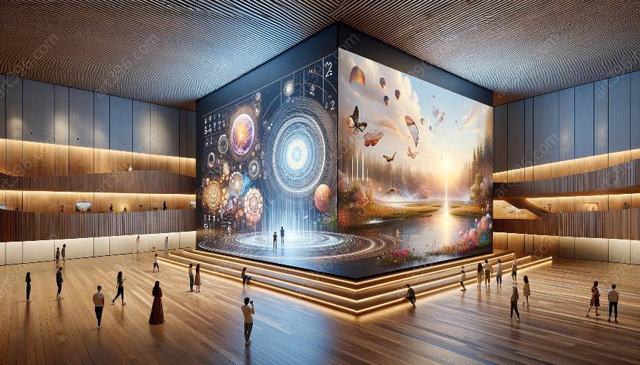
Creating an attractive and real visual hierarchy in interactive design involves understanding the key principles that determine how elements are organized and prioritized. This is closely related to aesthetics in interactive design, as it influences the overall look and feel of the user interface. Let's delve into the essential principles of visual hierarchy, exploring how they relate to interactive design and aesthetics.
The Role of Visual Hierarchy in Interactive Design
Visual hierarchy refers to the arrangement and presentation of design elements, helping users navigate and understand the interface. By establishing a clear visual order, designers can guide users’ attention and drive action toward specific content or interactive elements.
1. Size and Scale
One of the fundamental principles of visual hierarchy is using variations in size and scale to emphasize important elements. Larger elements tend to capture more attention, while smaller elements are perceived as subordinate. By manipulating the size and scale of interactive design elements, designers can direct users’ focus and create a sense of visual importance.
2. Contrast
Contrast plays a crucial role in shaping visual hierarchy, enabling designers to emphasize certain elements by making them stand out from the surrounding content. Contrasting colors, shapes, and textures can draw attention to interactive design features, making them visually striking and memorable to users.
3. Color and Typography
The strategic use of color and typography contributes significantly to visual hierarchy, as they play a key role in conveying information and emotional cues. Bold, vibrant colors and unique typography can be used to highlight important interactive elements and guide users through the interface with visual cues.
4. Consistency and Alignment
Consistency and alignment are essential in maintaining a clear visual hierarchy. By aligning elements and establishing consistent design patterns, designers can create a sense of order and predictability within the interactive design, making it easier for users to navigate and comprehend the interface.
Aesthetics in Interactive Design
When considering the principles of visual hierarchy in interactive design, it's crucial to acknowledge the impact on aesthetics. Aesthetics play a pivotal role in engaging users and shaping their overall experience with the interface. Visual hierarchy directly influences the aesthetics of interactive design, determining the visual appeal, coherence, and user engagement.
1. Design Balance and Harmony
A cohesive visual hierarchy contributes to the overall balance and harmony of interactive design, creating a pleasing and visually appealing interface. Balanced distribution of visual elements and harmonious design compositions can enhance the aesthetics of the interface, making it more engaging and inviting to users.
2. Emotional Impact and User Experience
Visual hierarchy influences the emotional impact of interactive design, eliciting specific user responses and enhancing the overall user experience. By strategically organizing and prioritizing elements, designers can evoke desired emotions and guide users through a more immersive and engaging experience.
Conclusion
In conclusion, mastering the key principles of visual hierarchy in interactive design is essential for creating compelling and aesthetically pleasing user interfaces. By understanding the role of visual hierarchy and its impact on aesthetics, designers can craft captivating interactive experiences that effectively guide users and leave a lasting impression.

